What is Responsive Design?
Responsive design is an approach that ensures web applications function well on a variety of devices and screen sizes. It is essential in today's multi-device world.
Key Principles
- Fluid Grids: Use relative units to create flexible layouts.
- Media Queries: Apply different styles based on device characteristics.
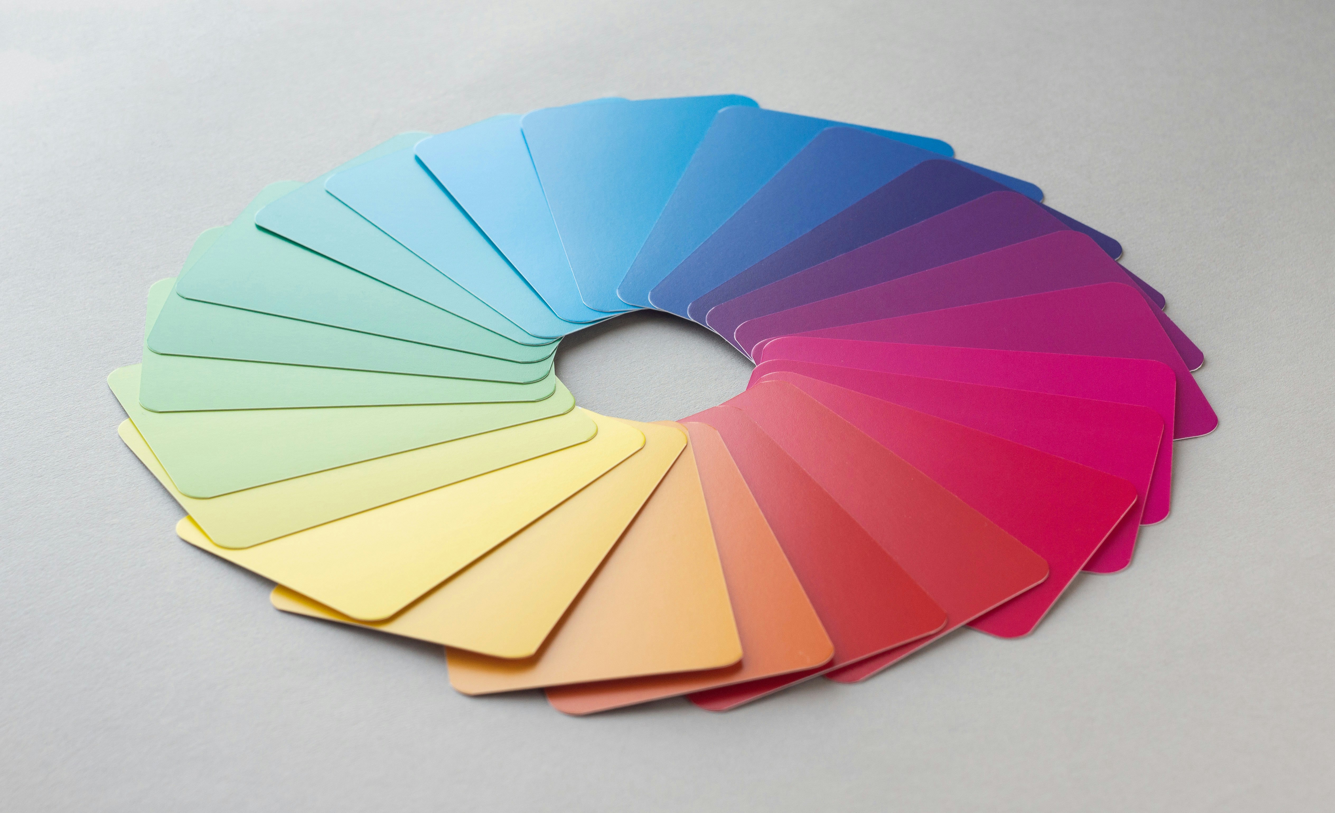
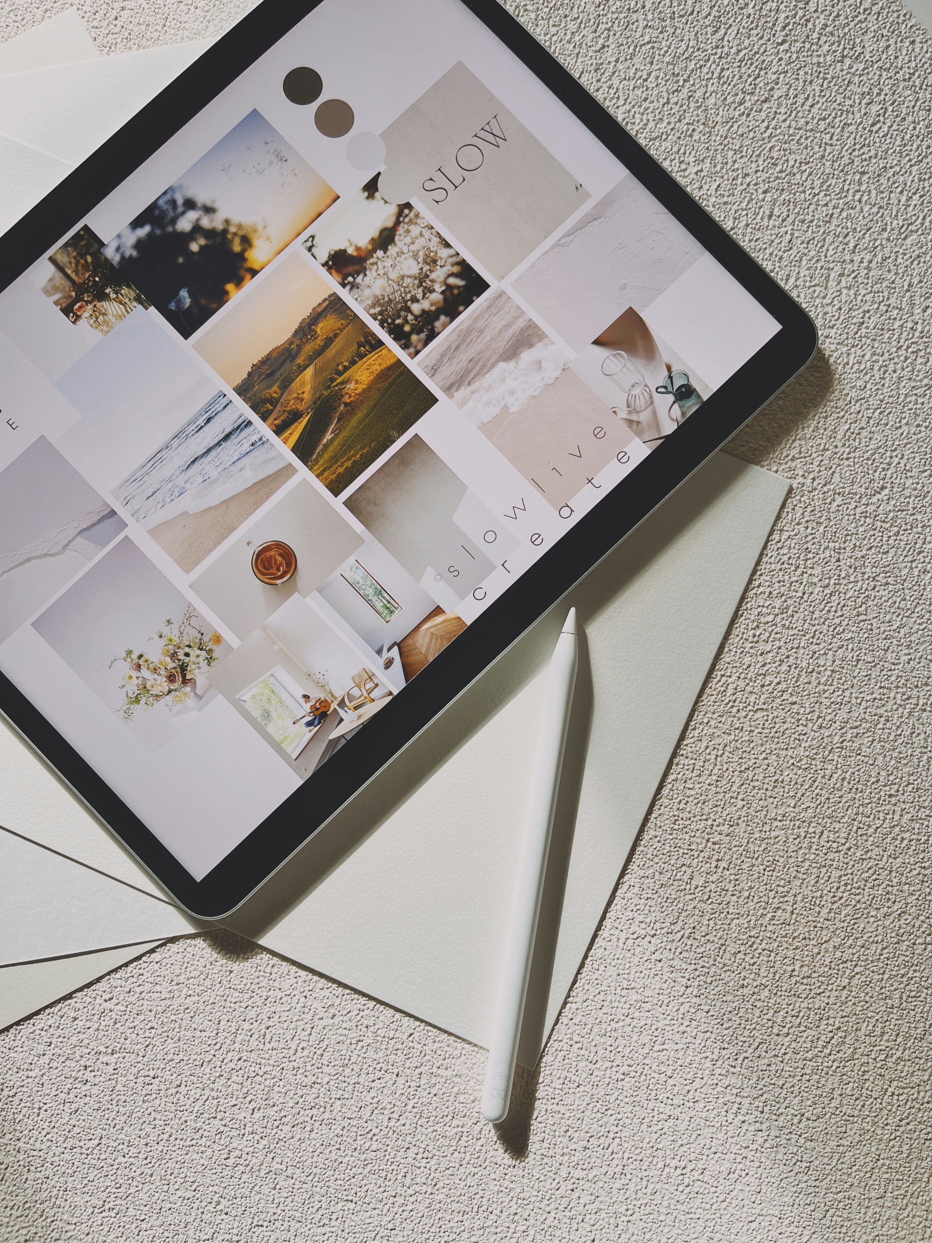
- Flexible Images: Ensure images scale appropriately within their containers.
By following these principles, designers can create websites that provide a seamless user experience across all devices.
Key Principles
- Fluid Grids: Use relative units to create flexible layouts.
- Media Queries: Apply different styles based on device characteristics.
- Flexible Images: Ensure images scale appropriately within their containers.
By following these principles, designers can create websites that provide a seamless user experience across all devices.